How to Design a Travel Website That Builds Trust and Wins Enquiries
Travel is emotional, but booking is a high-trust decision. These practical design principles show how to turn an aspirational travel website into a credible, easy-to-use enquiry journey.
Travel websites sell two things at once: the possibility of a memorable experience and the confidence that getting there will be handled properly.
The first part is emotional. Strong photography, atmosphere and a sense of place help someone imagine the trip. The second part is practical. Visitors need to understand who they are dealing with, what the service includes, what happens next and whether it feels safe to make contact.
That balance shaped my travel website design for the KS Escapes website. The brand needed to feel aspirational enough to spark interest, but clear and personal enough to support an enquiry. Here are the principles behind that approach — and how other service businesses can use them.
1. Lead with the customer outcome
A visitor should not have to interpret a clever headline before they understand why the business exists.
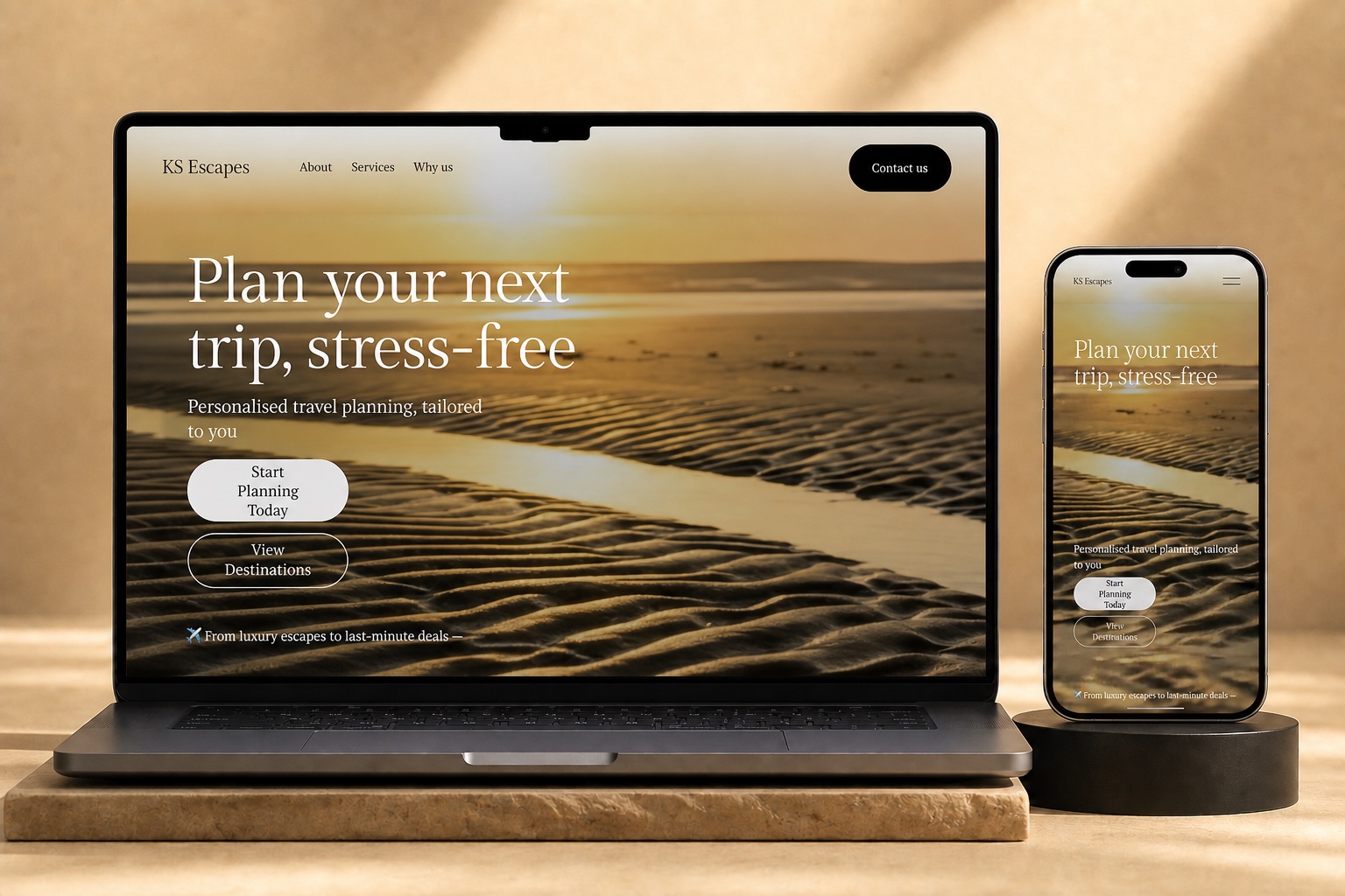
The KS Escapes homepage opens with “Plan your next trip, stress-free”. It describes the outcome in the customer’s language: less overwhelm and a trip tailored to them. The supporting line then explains the service — personalised travel planning — without competing with the main promise.
This is a useful hierarchy for almost any service website:
1. State the result the customer wants.
2. Explain the service that produces it.
3. Give them one obvious next step.
Creativity still matters, but it works best after the proposition is clear.
2. Pair inspiration with specific reassurance
Travel imagery creates desire, but desire alone does not reduce risk. A potential customer also wants evidence that the business understands the practical side of the trip.
That is why the KS Escapes service section includes details such as package protection where applicable, options from multiple UK airports and the types of support available. These specifics help the offer feel real and considered.
The principle is simple: every emotional claim should be supported by something concrete. “Stress-free” becomes more believable when the visitor can see that planning, booking support and travel extras have been thought through.
Only publish safeguards or protections that genuinely apply to the product being offered. Accuracy creates more trust than a crowded row of generic badges.
3. Make the person behind the service visible
For an independent business, being smaller can be an advantage. Customers are often choosing direct access, care and accountability rather than a call-centre experience.
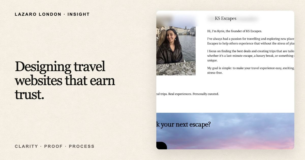
KS Escapes introduces Kyrie, explains why she started the business and describes the kind of trips she helps plan. This turns an abstract travel service into a relationship with a real person.
A strong founder section does not need to be long. It should answer three questions:
- Who will I be dealing with?
- Why do they care about this work?
- What will it feel like to work with them?
A current portrait, a direct first-person introduction and a believable reason for starting the business usually do more than a paragraph of corporate language.
4. Organise the offer for scanning
People rarely read a homepage from top to bottom on their first visit. They scan for the part that matches their need.
KS Escapes offers five connected services, from deal sourcing to group trips and travel extras. Presenting all of that as one continuous block would make the offer feel more complicated than it is. An expandable service structure keeps the page calm while allowing interested visitors to reveal more detail.
This is sometimes called progressive disclosure: show the essential information first, then let people access depth when they need it.
It works particularly well when a business has several services that share the same audience and call to action.
5. Explain what happens after the click
“Contact us” can feel like a bigger commitment than designers expect. A visitor may wonder whether they are starting a sales call, requesting a quote or committing to a booking.
The KS Escapes process reduces that uncertainty to three steps:
1. Enquire with the destination, budget and dates.
2. Receive a personalised plan and suitable options.
3. Approve the plan, receive booking guidance and travel.
This makes the next step feel finite and manageable. It also signals that the business has a repeatable process rather than improvising every enquiry.
If your service is complex, do not add more process steps just to look thorough. Show the smallest number that accurately explains the journey.
6. Use calls to action that match intent
Not every visitor is ready to do the same thing. Someone near the top of the page may want to browse destinations, while someone who has read the full offer may be ready to submit their dates and budget.
The site therefore uses two levels of action: a primary route into planning and a secondary route for exploration or direct contact. The final section removes ambiguity by offering a structured enquiry form and an email option, together with a stated 24-hour response expectation.
Good calls to action answer both “What do I do?” and “What happens if I do it?”
7. Design the mobile decision, not just the mobile layout
Responsive design is not simply shrinking the desktop page. On a phone, visitors have less visible context and are more likely to be interrupted.
The mobile experience therefore needs a sharper order of importance:
- the customer promise;
- the supporting explanation;
- a clear primary action;
- short, scannable proof;
- an easy way to return to the action later.
Large type, strong contrast and generous tap targets matter, but hierarchy matters more. The goal is to preserve the decision-making journey on a smaller screen.
8. Build proof honestly
Newer businesses do not always have a large library of testimonials or performance data. That is not a reason to invent authority.
Process transparency, precise service information, a visible founder, realistic response expectations and clear contact details are all legitimate trust signals. Add testimonials once real customers have approved them, and use performance figures only when they can be traced to reliable analytics.
Credibility is cumulative. Several small, accurate signals are stronger than one unsupported headline.
A practical trust checklist
Before launching a service website, ask:
- Can a first-time visitor explain the offer after ten seconds?
- Is the main customer outcome stated in plain language?
- Are important services and limitations specific?
- Can visitors see who is accountable for the work?
- Is the enquiry process easy to understand?
- Does every call to action make the next step clear?
- Does the mobile version preserve the same decision path?
- Are testimonials, protections and results accurate and approved?
If any answer is no, the website may look finished while still leaving a sales objection unresolved.
The takeaway
The strongest travel websites do not choose between aspiration and clarity. They use beautiful visual direction to create desire, then make the service, process and next step feel safe.
That is the real job of conversion-focused design: not to pressure visitors, but to remove avoidable uncertainty. When the experience feels personal, specific and organised, an enquiry becomes a natural next step.
Key Takeaway
Trust grows when aspiration is backed by specifics: a clear promise, an organised offer, a visible person, an understandable process and an honest next step.
Related Work
KS Escapes
A calm, trust-led travel website that turns an independent planning service into a clear, credible route from holiday inspiration to enquiry.