Website Redesign That Increases Conversions in London
A practical guide to redesigning a London business website around clearer messaging, stronger trust, better user journeys and more opportunities to convert visitors into enquiries.

How a Website Redesign Can Increase Conversions
A website can look polished and still make it unnecessarily difficult for a potential customer to become an enquiry.
That distinction matters when deciding whether your business needs a new visual style or a genuine redesign.
Changing fonts, colours and imagery might improve perception, but it will not automatically fix unclear positioning, weak proof, confusing navigation or an enquiry journey that leaves visitors unsure what to do next.
For a London service business, a conversion-focused website redesign should begin with a different question:
What is preventing the right visitor from understanding the offer, trusting the business and taking the next step?
A successful redesign removes those obstacles systematically.
What does conversion-focused website redesign actually mean?
Conversion-focused design is not about filling every page with buttons, pop-ups and sales messages.
It is about reducing uncertainty.
Before someone contacts a business, they usually want to understand what is being offered, whether it applies to them, why they should trust the company and what will happen after they enquire.
Every important part of the website should make one of those decisions easier.
That means the redesign process starts with the customer journey rather than the colour palette.
Visual design still matters. Strong typography, imagery, movement and composition influence how established a business feels. But those elements are much more useful when they support a clear commercial structure underneath.
1. Find out why the existing website is losing enquiries
Before changing the website, understand what the current version is failing to do.
A website receiving very little relevant traffic has a different problem from one receiving visitors who consistently leave without enquiring.
If the website is not attracting the right people, the solution may involve stronger search architecture, dedicated service pages and a closer relationship between content and customer intent.
If relevant visitors are already arriving but rarely take action, the issue may sit closer to positioning, proof, usability or the enquiry journey.
Look at the existing website as a sequence.
Where does someone arrive?
What do they understand first?
Where do they learn about the service?
Where do they see proof?
How easy is it to understand the process?
What happens immediately before the enquiry?
A redesign becomes considerably more useful when each major change responds to a specific weakness rather than a general feeling that the website looks old.
This is also why redesign work should connect with the wider website design process, rather than being treated as surface-level decoration.
2. Make the offer clear within the first screen
One of the easiest ways to weaken conversions is to make visitors interpret what the business actually does.
A strong opening section should usually establish three things quickly:
- what the business does;
- who it helps;
- what useful outcome it creates.
That does not mean every website needs an unimaginative headline.
A distinctive creative direction can still work, but the surrounding copy needs to remove ambiguity.
A visitor should not have to move through several sections before understanding why the service might matter to them.
Good conversion design respects attention.
It makes clarity immediate rather than something the visitor has to earn by continuing to scroll.
3. Structure the website around customer intent
Many websites grow without a deliberate information architecture.
A new service gets added to an existing page.
Another type of customer gets mentioned in a paragraph.
Case studies sit separately from the statements they could prove.
Important search topics get compressed into one general services page.
Eventually, the website contains plenty of information but very few clear journeys.
A redesign is an opportunity to rebuild that structure around the questions customers actually arrive with.
A commercially important service should have enough space to explain the problem, offer, process, relevant proof, objections and next step.
That is why Lazaro London has a dedicated Website Redesign page rather than treating redesign as a few lines inside the broader Web Design service.
The same principle applies throughout a business website.
Someone should be able to move from a broad service into increasingly relevant information without repeatedly returning to the navigation to work out where to go next.
Clear site architecture can improve usability while also giving search engines stronger relationships between your important pages. Lazaro London's current SEO approach similarly treats internal linking and site architecture as part of giving important search intent a clear destination.
4. Put proof beside the claims it supports
Testimonials and case studies are useful, but their position matters.
If a page claims that the business has a reliable process, specialist knowledge or the ability to produce a particular outcome, supporting evidence should appear close enough to strengthen that statement.
Do not make visitors remember a claim from one part of the website and then hunt for evidence elsewhere.
A useful conversion pattern is:
Claim → Evidence → Next step
For example, if a website explains that a structured customer journey can make an independent service business easier to trust, a relevant case study can immediately demonstrate how that thinking was applied.
The KS Escapes case study is a useful example. Its website was structured around explaining the offer, establishing trust and giving visitors clearer routes into an enquiry.
A smaller amount of believable evidence is usually more valuable than generic statements or impressive-looking numbers that lack context.
5. Reduce friction around the enquiry
A call to action is more than a button label.
It is the complete experience surrounding the decision to click.
A generic Contact Us button can leave several questions unanswered.
Is the visitor requesting a quote?
Are they immediately booking a sales call?
How much information will they have to provide?
Do they need a finished brief?
When will someone respond?
A conversion-focused redesign removes as much of that uncertainty as possible.
Explain the next step.
Keep initial forms proportionate to what is actually needed.
Tell the visitor what happens after submission.
Make it clear that they are beginning a conversation rather than entering an unnecessarily complicated sales process.
Your own project enquiry page follows this principle by explaining the progression from enquiry to conversation to recommendation.
The goal is not simply to make the button more noticeable.
It is to make taking the action feel safe and understandable.
6. Design the mobile decision journey separately
Responsive design is not simply a desktop website at a smaller width.
On mobile, visitors see less context at once.
Sections become longer.
Supporting information moves further away from the claim it supports.
Navigation requires more deliberate action.
Forms can feel significantly more demanding.
That changes how someone evaluates the page.
During a website redesign, check whether the mobile experience still communicates the main proposition quickly, introduces proof at the right moments and keeps important actions easy to reach.
Consider the order of information, not only its size.
A section that works perfectly as a two-column desktop layout may need an entirely different sequence once those columns become a vertical stack.
The design needs to preserve the decision-making logic of the page even when its layout changes.
7. Treat copy as part of the redesign
Weak messaging cannot be rescued by better spacing.
A website filled with claims such as quality service, tailored solutions and customer-first approach may sound positive while communicating very little.
A redesign can simply make that uncertainty look more attractive.
Conversion-focused copy should make the service more specific.
What exactly is included?
Who is it suitable for?
How does the process work?
What makes the approach different?
What concerns might someone have before getting in touch?
Those questions should shape the content.
The website's visual hierarchy tells visitors what matters first.
The copy gives that hierarchy meaning.
They should be designed together.
8. Protect existing SEO during the redesign
A redesign should not treat the existing website as disposable.
If pages already receive search impressions, rankings, backlinks or relevant traffic, those signals should be understood before URLs and content are changed.
Useful pages may need to be retained and improved rather than replaced.
Old URLs may require redirects.
Headings, metadata, internal links and page intent should be mapped before launch.
This becomes particularly important when the redesign introduces stronger dedicated service pages.
New pages can give important searches a clearer destination, but they also need deliberate relationships with the pages that already carry relevance.
That is where redesign and SEO overlap.
A strong website needs the right person to discover the right page and then have enough confidence to take action.
Your website architecture, search visibility and conversion journey should therefore reinforce one another instead of being treated as separate projects.
9. Measure what visitors do after launch
A website redesign is not finished simply because the new site has been published.
The initial redesign creates a stronger hypothesis about how customers should move through the website.
Analytics then helps show where that hypothesis is working and where further improvement is needed.
For a service business, the primary conversion may be:
- a completed enquiry;
- a consultation booking;
- a phone call;
- a quote request;
- another commercially meaningful action.
Supporting behaviour can also reveal useful patterns.
Which service pages are visitors reaching?
Are people viewing relevant case studies?
Do they begin the enquiry journey but fail to finish it?
Which landing pages are producing the strongest qualified traffic?
Decide what success means before launch.
Otherwise, a redesign risks being judged primarily by whether people think it looks better rather than whether it has become more commercially useful.
When the website is live, ongoing website support can then focus on measured improvements rather than arbitrary redesigns.
When is a website redesign likely to increase conversions?
A redesign is most valuable when the existing website contains real friction.
The offer may have changed while the site stayed the same.
The navigation may no longer reflect what the company actually sells.
Important proof may be missing.
The business may look less established online than it does in reality.
Mobile usability may be poor.
The enquiry process may feel vague or unnecessarily difficult.
Those are redesign problems because they affect the complete customer experience.
By contrast, if the website already communicates the offer clearly and converts well but almost nobody relevant visits it, increasing visibility may deserve greater priority.
Conversion optimisation cannot convert visitors who never arrive.
The strongest strategy therefore connects both sides: improve the experience for the traffic already reaching the business while creating a structure capable of attracting more relevant demand.
Website redesign conversion checklist
Before approving a new website, ask whether a first-time visitor can clearly understand:
- what the business does;
- who the service is for;
- why they should choose this company;
- which service matches their problem;
- what evidence supports the main claims;
- how the process works;
- what they should do next;
- what happens after they enquire;
- whether the same journey works properly on mobile;
- how useful existing search visibility is being preserved;
- how meaningful conversions will be measured after launch.
If several of those answers remain unclear, the website may be visually complete without being commercially complete.
The takeaway
A website redesign increases conversions when it removes the reasons a suitable prospect hesitates.
That normally means clearer positioning, stronger information architecture, better proof, more useful copy, a simpler customer journey and an enquiry process that feels predictable.
The visual identity then has an important role: make that clarity feel credible, distinctive and appropriate for the value of the business.
For London businesses considering a redesign, the objective should not simply be to create a newer version of the existing website.
It should be to create a stronger route from discovery → understanding → confidence → action.
If your current website has stopped reflecting the business behind it, explore Lazaro London's website redesign service or start a project.
Key Takeaway
A website redesign increases conversions when it removes uncertainty. Clarify the offer, organise the customer journey, place proof beside important claims and make the next step easy to understand.
Related Work
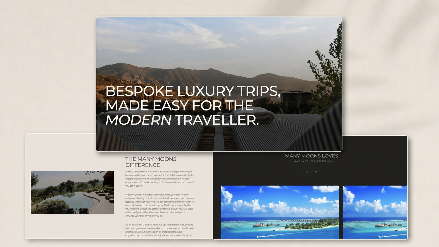
A self-initiated Webflow concept that reimagines a luxury travel consultancy through a more immersive, editorial and carefully paced digital experience.